What do Leonardo da Vinci and Bob Ross have in common?

Leonardo da Vinci and Bob Ross? Really? Other than inspiring many, many people to try their hand at painting, probably not much.

Honestly, I don’t know if they have much in common outside of the fact that there are both painters that are admired by a lot of people.
Recently, I did make one observation that I had somehow missed over the years. Both painters advocate for the use of a black background or black canvas. After having watched many Bob Ross, the joy of painting episodes. I’ve noticed that there are dozens and dozens of episodes where he starts with the black canvas and often times will opine on the advantages of doing so.
Meanwhile, da Vinci has been attributed with the famous quote, suggesting that the study of nature would have us conclude that the best way to start a painting is with a black background.
A painter should begin every canvas with a wash of black, because all things in nature are dark except where exposed by the light.
-Leonardo da Vinci
One night, while suffering from a bit of insomnia, i turned on “The Bob Ross Channel” in hopes that it might help quiet my mind and help me fall back asleep. Needless to say it worked! It always works! I tend to fall asleep after the first episode.
This late night Bob Ross binge watching session featured one of his paintings that began with a layer of black gesso on the canvas. Several days later I ordered some black gesso and started experimenting a bit by starting my own paintings with that initial preparatory step.
While I only use this approach occasionally I do find myself wondering why I don’t do it more often.
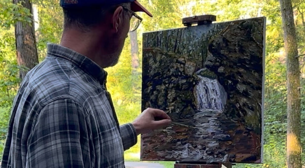
Here are just some of the black gesso paintings that I’ve done in the past few months.
Most of these are pictures of paintings that are works in progress and all but one were painted en Plein Air.
Here is what I enjoy most about starting with a black surface:
The artist has no choice but to focus more attention on negative shapes
It requires a more intense focus on the lighter values use of brighter colors
Greater contrast can be achieved in the painting with less effort and less risk of muddying the colors
I have yet to experience any obvious negative consequences of using black gesso. The only adjustment I have had to make is when I use transparent colors (like India yellow). I’ve had to apply an initial layer of titanium white (or some other lighter opaque color) to ensure the desired affect is achieved.
Well thanks for hearing me out. Stay cool during this heat wave. Also be sure to check out my shop. Lots of updates have been made and more are coming. Several paintings have sold and some commission work is about to begin.
Enjoy the early days of summer!


tỷ lệ kèo nhà cái mình thấy mọi người nói hoài nên tiện tay vào xem thử cho biết thôi. Mình không đào sâu nội dung gì, chủ yếu ngó qua giao diện với cách họ trình bày thông tin có dễ theo dõi không. Vừa vào là thấy bố cục khá thoáng, chia khối rõ ràng nên kéo xuống không bị rối mắt. Mình thích nhất mấy bảng họ làm dạng cột gọn, chữ nhìn vừa phải, liếc nhanh cũng hiểu đang nói gì. Thanh menu cũng để chỗ dễ thấy, bấm qua lại giữa các mục khá mượt, không phải mò. Nói chung cảm giác dùng kiểu “lướt phát hiểu”, nhất là cách họ xếp các khối nội…
Bài viết đọc dễ vào, nhất là đoạn nhắc ghi điều biết ơn mỗi sáng, cảm ơn bạn đã chia sẻ. Mình thì hay theo dõi thống kê XSMB hằng ngày nên tự gom lại thành một trang tổng hợp để tra cho nhanh, khỏi phải lục nhiều nơi. Mình cũng lưu lại bài này để nhắc bản thân làm đều hơn. Ai cần xem cập nhật theo ngày thì ghé https://land-book.com/soicauxsmbpro1vn